Social Health Network – Navigation Redesign
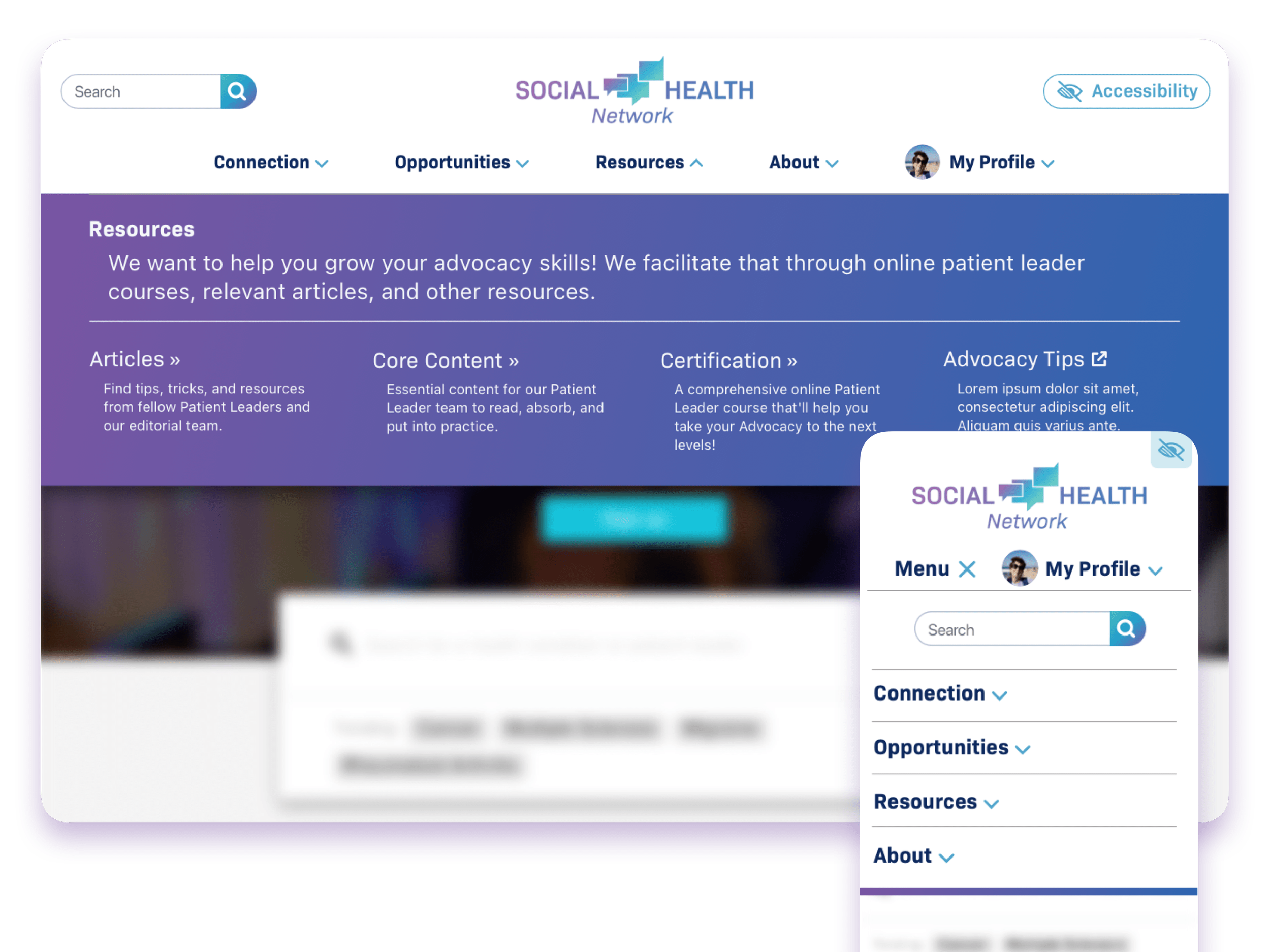
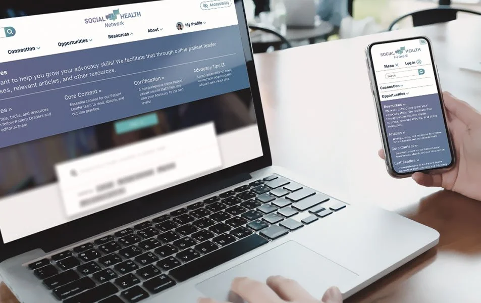
Designed a full-screen, branded navigation system for 30+ chronic-condition communities to make it easier for patients and caregivers to discover more stories, resources, and support without relying solely on social traffic.
Social Health Network connects people living with chronic conditions through condition-specific communities, news, and lived-experience stories.
As an art director at Health Union, the focus was to create a navigation system that felt cohesive across 30+ sites while staying true to each condition’s voice and the wider Social Health Network brand.
This was a self-initiated project: defining the opportunity, building the concept, and partnering with the Creative Director and Product Managers to refine a solution that could realistically be implemented.
The challenge
Analytics showed that most visitors landed from social media, consumed a single article, and then left, with very little page-to-page navigation or exploration.
The existing navigation was cluttered, relied on short, vague labels, and hid key content under ambiguous single-word links, making it hard for people to understand what else was available.
At the same time, leadership was risk-averse about changing a platform that powered 30+ condition sites, and engineering capacity was limited, so any redesign had to be straightforward to implement and scale.
Original navigation:
fragmented structure, duplicated links, and ambiguous labels made exploration harder.
![Flow chart of an existing site structure including categories like Community, Basics, Symptoms, Diagnosis, Treatment, Living with condition, Mental Health, Health Resources, Caregiving, Featured Collections, CMP 1, CMP 2, [Condition] & Covid-19. Subcategories include Stories, Forums, Community Advocates, Advocate Archive pages, Editorial Team, Community Rules, Core Content subpages, etc. Additional notes on exceptions and missing items are on the right side.](https://images.squarespace-cdn.com/content/v1/6a0608b8ba7bea63c25070e7/aa0f3755-e3db-4ede-bbcf-ab48bb7d2fbd/65f06d7d6e70cbf4e24a699f_Screenshot+2023-05-08+at+5.37.33+PM.png)
What the audit revealed
A content and structure audit in Miro stripped away visuals to focus purely on hierarchy, labeling, and grouping across multiple condition sites.
This revealed overlapping categories, inconsistent naming, and important resources buried multiple levels deep—problems that strong visuals alone couldn’t solve.
From this, the goal became clear: simplify the IA into a small set of intuitive buckets, expose more destinations at a glance, and use typography and color to guide attention, not decorate.
Updated navigation:
streamlined structure grouped by user mental models and content type.
![Flowchart illustrating a proposed new site structure for a community health website. It includes sections like Our Community, What is [condition]?, Living with [condition], Resources, Search, Accessibility Tools, and Login, with various subsections such as Forums, Community Stories, Symptoms, Diagnosis, and Support Resources.](https://images.squarespace-cdn.com/content/v1/6a0608b8ba7bea63c25070e7/bdc8d0bf-c7b0-4127-8d28-71a640b44dfc/65f06ec981164c61f06b91f4_Screenshot+2023-05-08+at+5.37.58+PM.png)
Mega Menu
Reduces page noise and gives navigation its own dedicated space, encouraging users to explore rather than treat it as a secondary element.
Clear and Descriptive
Reduces page noise and gives navigation its own dedicated space, encouraging users to explore rather than treat it as a secondary element.
Branded Color Field
Uses a strong color block and restrained accent palette to create recognition, improve focus, and avoid visual clutter.
Scalable Pattern
Defined components, spacing rules, and hover states so this nav can roll out consistently across 30+ communities without reinventing the system each time.
The redesign is structured to support deeper storytelling and cross-site exploration: surfacing more condition resources, highlighting communities, and strengthening Social Health Network’s perception as a cohesive ecosystem.
Partnered with the Creative Director to refine the visual direction and narrative, then pitched the concept to Product Managers as a low-risk, high-impact pattern that could be rolled out incrementally.
If implemented, success would be measured by changes in page depth, navigation clicks, and repeat visits, helping quantify whether the new pattern actually improves exploration and engagement.